The goal of this data story is to highlight the trend of unintentional injuries leading to the deaths of black children in the US. The insights derived from this data can shape the focus of safety education campaigns in predominantly black communities in the US in order to reduce the incidences of deaths. According to the Center for Disease Control (CDC), accidents, also known as unintentional injury, is the leading cause of death in children below 14. Over the past few years, I have developed safety education products and programs to teach African children how to stay safe from unintentional injuries. Since coming to NYU and doing some research in the US, I have seen that there is a similar trend of unintentional injuries, but the injury mechanism leading to deaths varies by race and sex. Therefore, I decided to use the drill-down type of data story to zoom into the black community and highlight key insights that can guide a safety education campaign in partnership with relevant government agencies.
To generate this data, I wanted to see an overview of deaths arising from unintentional injury in the US across different age groups. The NCHS – Potentially Excess Deaths From the Five Leading Causes of Death provided an initial view of the death rates across different States in the US. In order to zoom into the injuries affecting children across races, I used the NCHS – Injury Mortality: United States dataset. Using a combination of these datasets, I was able to see data for all unintentional injuries across age groups. I was able to drill down to the injuries as they affected Hispanic, non-Hispanic white, and non-Hispanic black children. These datasets also identified the different injury mechanisms and the intent across different sexes. This was valuable information because I could see how a particular injury affected males and females differently.
In the first story point, I used a map to highlight locations, and then I leveraged hue to signify the intensity of deaths across each state. In the bar chart below, I also leveraged hue to depict intensity or lack of it. The bar chart was flipped to the side in accordance with best practices when using a bar chart. The axes were labeled to call attention to the race and numbers involved. In the second story point, bar charts and the same colors were used, however, the size of the two bar charts vary to call attention to the fact that they are not exactly the same even though it’s the same chart type and color. In the bar chart below, there is a filter to see the differences in unintentional injury by sex. For example, while black males experience death by drowning at 650 per 100,000, black females experience death by drowning at 250 per 100,000. Could it be that more black males face peer pressure to swim even though they know they do not have the skill?
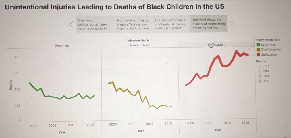
Furthermore, the third story point focuses on the top 3 unintentional injuries leading to the deaths of black children. I used a line chart and color to show the top 3 unintentional injuries. The axes are also labeled to call attention to the injury mechanism and the number of deaths associated with it. There is also a color key to differentiate each injury mechanism. In the final story point, I used a line chart and colors to show the trend of these deaths over 15 years. The line charts side by side are used to call attention to the fact that whilst deaths by drowning and fire-related causes are declining, deaths by suffocation keep going up. Color is used to differentiate each injury mechanism.
Based on these data, it is important for relevant US agencies to revisit their strategies for reducing suffocation affecting black children to ensure that the numbers decline over time. Whilst progress has been made in reducing deaths per 100,000 arising from drowning and fire-related causes, there is still more work to be done to bring it down significantly.


